Color Trends


Chanel Mirabella nail polish for summer 2014 review

DSC_0477

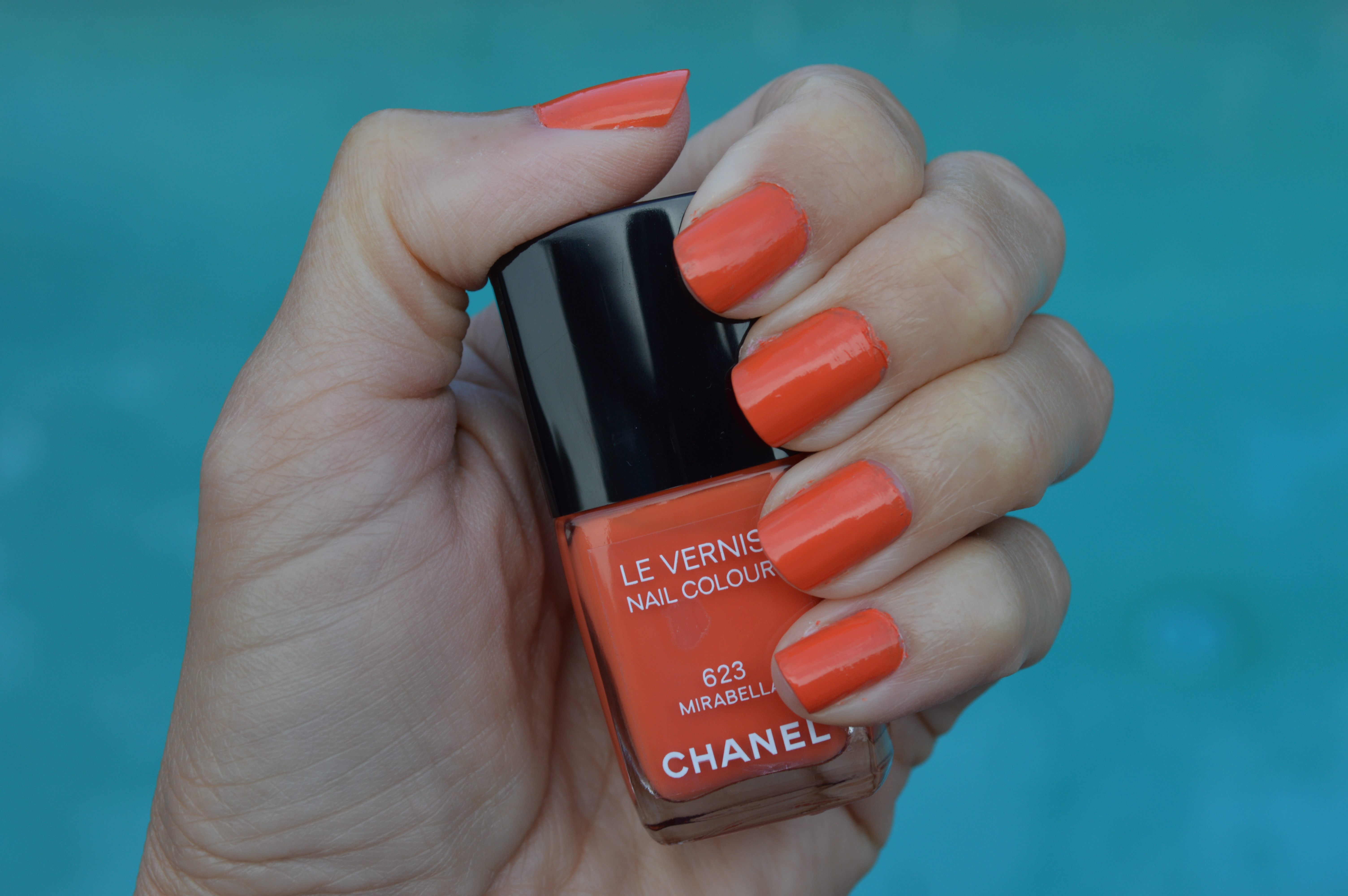
Pictured: Chanel “Mirabella” nail polish from the Chanel summer 2014 nail polish collection. Photo taken in overcast weather. Two coats of color, one base coat, no top coat.

Chanel Mirabella is a bright orange nail polish color from Chanel’s summer 2014 beauty collection. The bright orange hue teeters between being bright and neon. This is a hot nail polish color for the summer 2014. Orange nails, lipstick and tinted blush were all the rage on the spring/summer 2014 runways. This makes Chanel Mirabella nail polish the ultimate nail polish for the summer 2014 season; as well as right now!

The orange hue of Chanel Mirabella nail polish blends well with cool colors; which is unusual for an orange hued nail polish! Normally orange nail polish only works with shades of red, orange, yellow and neutrals. Not Chanel Mirabella nail polish! Chanel Mirabella has a slightly blue undertone which allows the nail polish to play well with shades of blue and pink. It does not play well with purple or green.

I tested out Chanel Mirabella nail polish with two coats of color, one base coat and no top coat. The polish proved to be chip resistant and lasted six days. I also felt like Chanel Mirabella nail polish made my skin look tan; which is always a plus!

Chanel always has the most beautiful selection of nail polish colors; and for summer 2014 the iconic fashion house did not disappoint! Although all of the nail polish hues from Chanel’s summer 2014 collection are beautiful, Mirabella is standing out as my favorite. The orange hue is fresh and playful; making it perfect for the summer season!

Chanel Mirabella nail polish can be found online here, here and here


Spring 2014 color trends: pastels

As we move into spring 2014, the color story for the warm weather season is changing. After several years of bright hues and neon colors, Fashionistas on the street are favoring shades of pastels over the bright, neon and vibrant hues many designers showed for spring 2014 on their runways. While store shelves are stocked with bright colors and neon hues, the pastel color palette is being snapped up faster than you can say “mint green.”

Spring 2014 has several color palettes from the runways. Designers in New York favored bright colors and medium hues while designer in Paris and Milan played with pastels and neons. Despite the brights, consumers seem to be gravitating towards pastels, signaling a trend away from neon brights and back towards light colors. Of course, when we move from spring into summer, the brighter hues and neon colors may make a resurgence.

The pastel hues for spring 2014 which are popular on the street include mint green, pale yellow, baby pink, and baby blue. Pastel hues are being mixed together, not color blocked, and also being paired with light neutral hues such as beige or white. As easy way to wear pastels this season, without investing in an entire new wardrobe, is to add a handbag or pair of shoes to your closet. Accessories make wearing the pastel easy and you don’t have to worry about clothing in a light color adding weight or not working with other pieces in your closet which may be bright or neon hued. In this color transition, you can easily pair a neon hue with a pastel color as I did in this post. If you do this, make sure you are only playing with one pastel and one bright color, too many colors and the whole thing can go wrong!

Neutral ensembles are also on trend this spring 2014 season. So, if you plan to wear the pastel trend through accessories, you can keep your clothing neutral and update the look with one pastel handbag! Love that!

Here are a few fabulous pastel pieces I found around the web. I assembled them into the shopping widget below. I hope you love them! Happy shopping, and stay fabulous 😉


Greenspiration for St Patrick’s Day 2014

DSC_0489

Photo: Suit: Banana Republic / Nail Polish: Chanel “Rose Moire” / Handbag: c/o Jill Milan (on Sale!)

St. Patrick’s Day 2014 is almost here! That means Fashionista’s everywhere need to make sure they have something green to wear in order to avoid getting pinched!

Unless you have something green in your closet left over from the 2013 Emerald green trend, you may find bright green a little harder to find in the spring 2014 than in the past few spring seasons. This does not mean there are not any green products on the market right now, it only means you will need to look a little harder and consider alternate shades of green to avoid getting pinched!

Spring 2014’s most important color trend is the pastel trend. This means the green apparel and accessories found on store shelves will be in the mint green range; as opposed to last year’s Leprechaun “Emerald” green. Mint green will work just as well as Emerald green did in year’s past to keep pinchers at bay. So rest assured, you can rock mint green on St. Patrick’s Day and still avoid getting pinched!

There are a lot of fabulous mint green, as well as Emerald and Kelly green products, on the store shelves as we speak. I found a few amazing peices around the web and assembled them into the shopping widget below. I hope you find the perfect “pinch repellent” below! Have a wonderful St. Patrick’s Day, happy shopping, and stay fabulous 😉

Have you ever wondered why we wear green on St. Patrick’s Day? Click here to find out!