Fall 2021 color trends from Pantone and NYFW
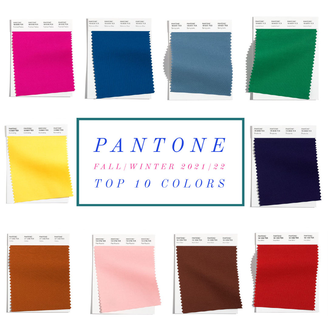
Top ten colors from the NYFW runways for fall/winter 2021/22 from top left: Fuschia Fedora / Mykonos Blue / Spring Lake / Leprechaun / Illuminating (color of 2021) / Rhodonite / Adobe / Pale Rosette / Root Beer / Fire Whirl /
Well, the fall looks bright! New York designers are looking towards a bright and cheery autumn season, which will stay bright and cheerful through the winter 2022 season. We should expect fun, lighthearted color combos on store shelves for fall 2021, which evoke feelings of happiness, hope, and exuberance. After all, by the time fall hits store shelves, the majority of us should be vaccinated, and this pandemic should be behind us. Fingers crossed!
There is noting like bright colors to lift one’s mood; especially yellow which is proven to lighten the mood. I’m looking forward to mixing light neutrals with bright hues when temperatures start to cool off in the autumn season. It will be a different feeling than the usually dark and somber fall season. We should all be cheerful and living the good life as things return to normal. Again, fingers crossed!
I think Fuchsia Fedora for all is a fabulous idea, and I also find myself drawn to Mykonos Blue, and Spring Lake. Those are definitely my three favorite colors from the fall 2021 palette. Now, let’s chat neutrals:
Fall 2021 neutral color trends from Pantone and NYFW
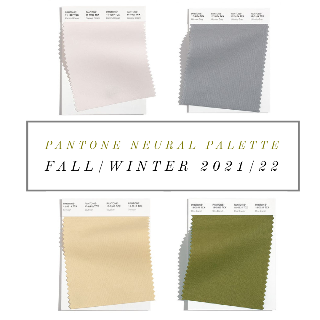
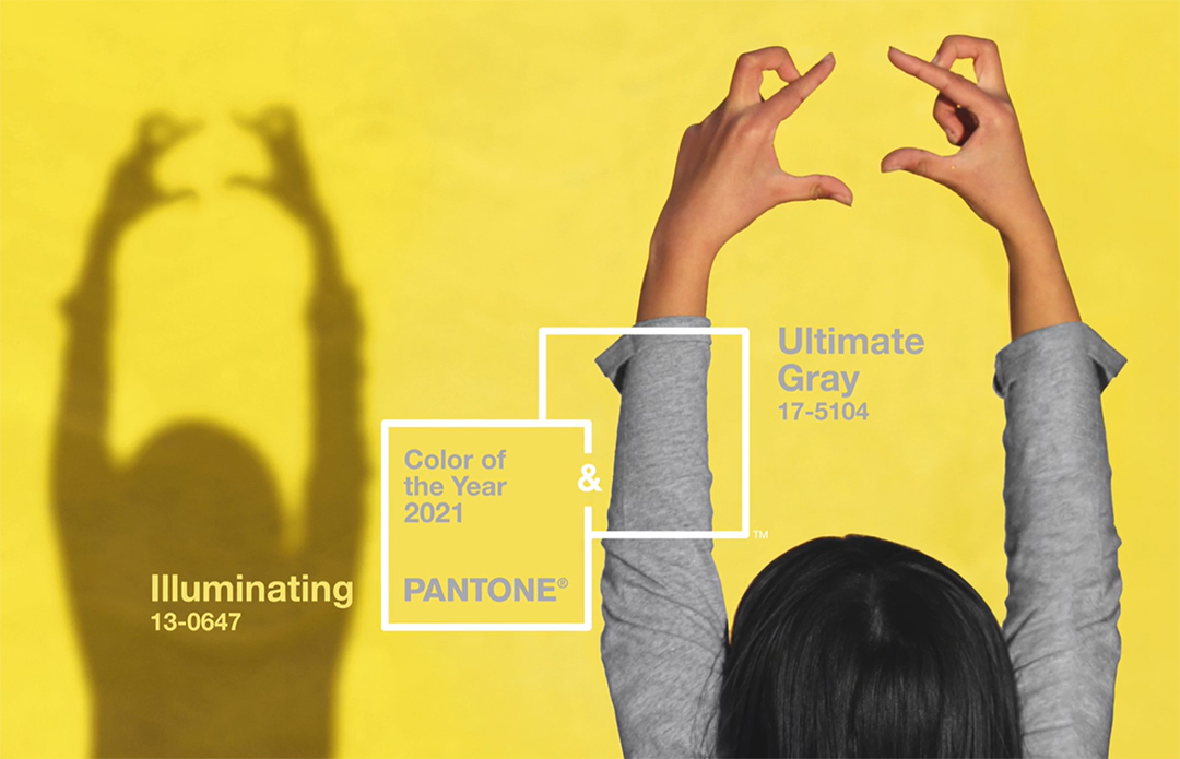
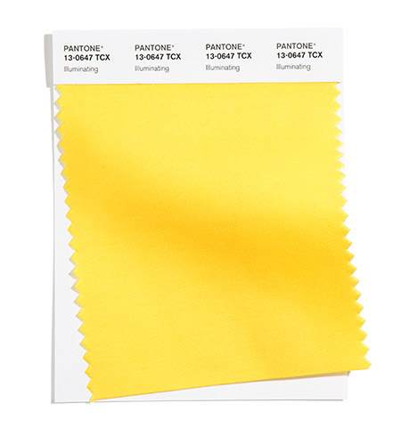
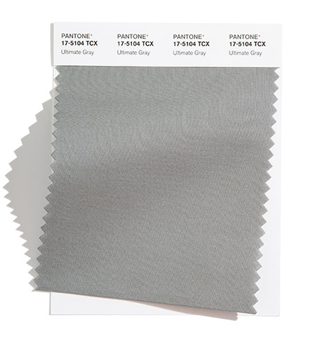
Top neutral color trends, NYFW & Pantone from top left: Coconut Cream / Ultimate Grey (color of 2021) / Soybean / Olive Branch /
These have to be the lightest fall neutrals I have witnessed in my career. They look like spring colors! While olive is a traditional fall shade, this one is lighter; like a spring olive hue rather than an autumn color. I think it will be fun to see how designers use it on cool weather clothing. I love the light mood for fall!
Well, there you have it. Like spring, designers are keeping a cheery color palette for 2021, and defying traditional autumn hues. I love the happy and uplifting colors we are seeing for autumn, and I look forward to brightening cold winter days in something bright, like Fuchsia Fedora! What do you think?
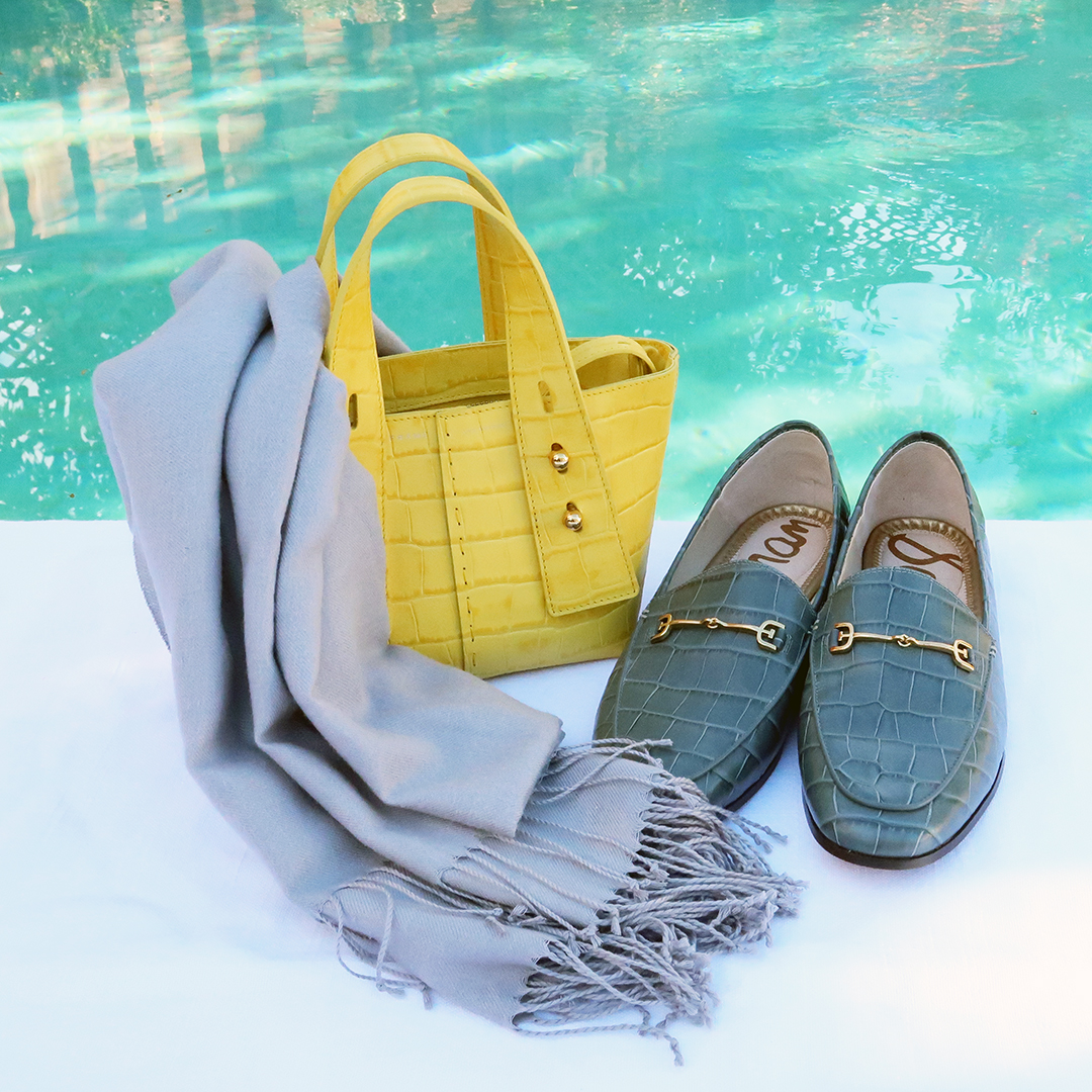
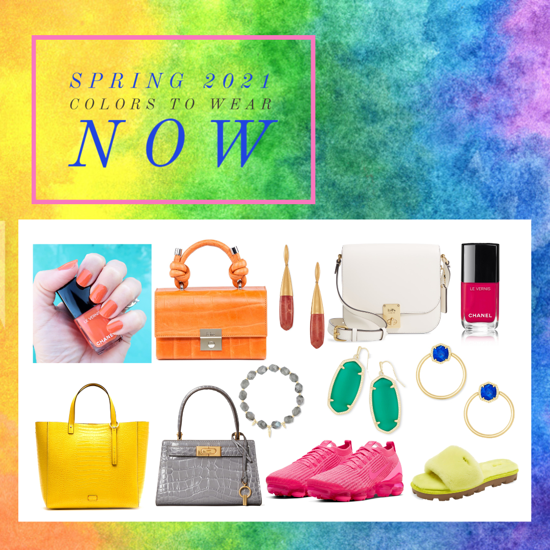
Shop spring clothing which reflects fall 2021 color trends online:

Thanks for stopping by, and stay tuned for my NYFW coverage for the fall/winter 2021/22 season this coming week!
XOXO
Cathy
*Color swatches courtesy of Pantone. Read Pantone’s report online here.