pantone


Spring 2013 color report from Pantone has arrived

Pantone released the spring/summer 2013 color report today and it has given Fashionistas everywhere a sneak peek into the ten hottest hues for the upcoming spring 2013 season.

The fresh color palette is slightly softer than it was for spring 2012 and it appears that any shade of blue will be hot for 2013. After all, earlier this year Pantone declared that blue would be the new black for 2013; according to this chart, it will be!

Since Pantone’s predictions are based on New York designer preferences, it does appear that the soft pastels from Paris in 2012 have traveled to our side of the globe and mixed in with our bright hues from 2012. The softer colors are still cheery and bright; just not as neon as originally forecasted.

What do you think of the spring 2013 color palette? Do you have a favorite hue?

spring2013colorreport


Spring 2013 color forecasts from Pantone: Blue is the new Black

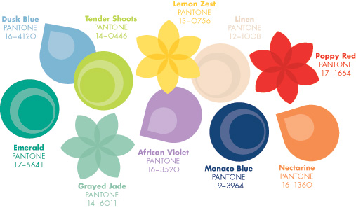
Pantone has given us a sneak peek into the color palette for spring 2013, and it is nothing short of fabulous! The colors forecasted for next year’s warm weather season are lively and vivacious; as described by Pantone.

Put on your sunglasses because designers are favoring florescent hues, pastel shades and many colors have become the “new neutrals.”

Here is a breakdown of what to expect in the color palette for spring and summer 2013:

  • Blue is the new black. Shades of blue will not be watered down, and they will be the base for many ensembles in the spring 2013 season.
  • Neutrals are being transformed and offering shades of color as opposed to being basic beige or sand.
  • Bright colors are still hot and will evolve with new color combinations put together in unexpected ways by designers.
  • Metallics are still important but will be found intertwined in fabrics and materials as opposed to 2012’s overt metallic trend.
  • Black is still relevant, although sidelined by blue for spring 2013. Black will be played with, and like fall 2012, the classic hue will be found in varied textures, materials and offered as depth rather than a flat shade.
  • Brown will be an alternative base color and will be used to compliment the colors of the season.

There you have it! Pantone has given us a sneak peek into spring/summer 2013. The spring/summer 2013 runways will debut in early fall and here at Bay Area Fashionista we will be watching to bring you the newest trends hot from the runway.
Watch us this fall! We will be bringing you the top ten colors for spring/summer 2013 too.

Wondering how to get a head start on the spring/summer 2013 color palette? While shopping the summer sales this month, look for florescent hues, shades of blue which are not watered down and textured fabrics in black. They will be great items for next year and will help you be ahead of the runway fashion curve.

Happy shopping and stay fabulous 

spring2013pantone


Pantone releases the fall 2012 color report

Pantone has released their color report for the fall 2012 season. While the authority on color released their color forecasts for the fall and winter season last October, the official report was released on the first day of New York Fashion Week; February 9, 2012. 

The color reports for women and men are quite similar. Tangerine Tango, the “IT” color for 2012 was on the list as well as bright blue, medium pink and a soft purple shade named “Rhapsody.”
The color report shows that bright colors are staying put for the cool weather season while lighter, pastel shades are slowly creeping into the spectrum. Grey also made the list as a top color for fall, signaling the neutral hue could be used in place of black for the cool weather season. 
Pantone’s fall 2012 color report helps shopper make buying decisions during the spring season since Fashionista’s now have a sneak peek into which colors have staying power and which shades are fleeting trends.
For more information about Pantone, please visit pantone.com
pantonefall2012