pantone


Fall 2013 color report

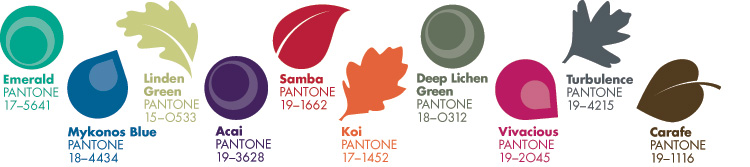
Pantone has released the fall 2013/winter 2014 color report! With New York Fashion Week autumn/winter 2013/2014 starting today, the new fall color palette is being revealed on the runway. Pantone has put together a fabulous report which showcases the top ten colors for fall 2013.

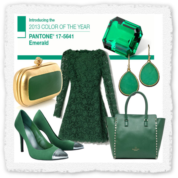
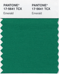
In fall 2012 we enjoyed a colorful palette which was vibrant and flowed easily from the cheery colors we enjoyed in spring 2012. For fall 2013, the color palette is more somber and offers a more traditional look at colors. Instead of bright hues, the colors are darker and more on the neutral side. The color of 2013, Emerald green is still important and as are blue, purple and pink; but the colors are more like “splashes” which liven up darker ensembles and overall looks.

What do you think of the fall 2013/winter 2014 color report? Join us on Facebook and let us know!

fall2013colorreport


Emerald inspiration for 2013

Pantone announced last week that the Color of 2013 is a beautiful, jewel-tone green hue named “Emerald.” This vibrant shade of green has been popular over the past few seasons and is expected to explode as spring/summer 2013 and fall/winter 2013/2014 hit store shelves.

Designers showed Emerald green in every way imaginable on the runways in New York, Paris, Milan and London for the spring/summer 2013 season. In addition to shoes, apparel, handbags and jewelry, Emerald green was shown on nail polish and also on eye shadow. If it can be Emerald green, it will be!

In addition to what we wear, Emerald green is expected to be a hot color for interior design too. This will be the hue we wear, sleep and play in; fabulous!
What do you think of Emerald green? Will you wear it? Will your new throw pillows be a vibrant shade of Emerald? Join us on FacebookTwitterGoogle +, TumblrPinterest or our new Instagram and let us know what you think of Emerald!

c600x599 (1)