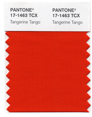
Pantone declares Tangerine Tango the color of 2012
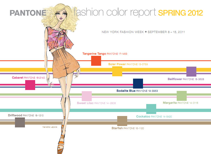
Pantone, the expert on color trends for fashion, interior design-and anything that comes in color, announced today that the color of 2012 is Tangerine Tango 17-1463. Bye-bye- Honeysuckle! Of course, we here at Bay Area Fashionista suspected this could be the case since the runways in Paris, Milan, New York and London were filled with the reddish-orange hue. When Pantone declared the top ten colors of spring 2012 back in September, Tangerine Tango looked like it was in the lead for being declared the “IT” color for the new year.
Tangerine Tango is an interesting shade since many people in the world are not a fan of the color orange. Although designers fancied the bold hue in their runway collections for the spring 2012 season, it should be interesting to see if store buyers decided to stock their shelves with Pantone’s Tangerine Tango, or if they decided to stick to colors which traditionally have been more popular with shoppers such as bright yellows and bold blues.
At any rate, if orange is your thing, shop for Tangerine Tango items now! Before they disappear from store shelves; after all, Pantone has declared it is the ultimate color for the spring 2012 season.
Not into Tangerine Tango-or any shade of orange, but feel compelled to rock the shade anyway? Never fear! You can easily rock Pantone’s color of 2012 Tangerine Tango without feeling too bright. Pick up a fabulous orange clutch or orange shoes and pair your bold accessory with a neutral outfit or crisp white dress. You will be HOT for spring 2012 and you won’t have to worry about the bright orange color being too overbearing.
To learn more about Pantone and color of the year for 2012 Tangerine Tango, please visit pantone.com