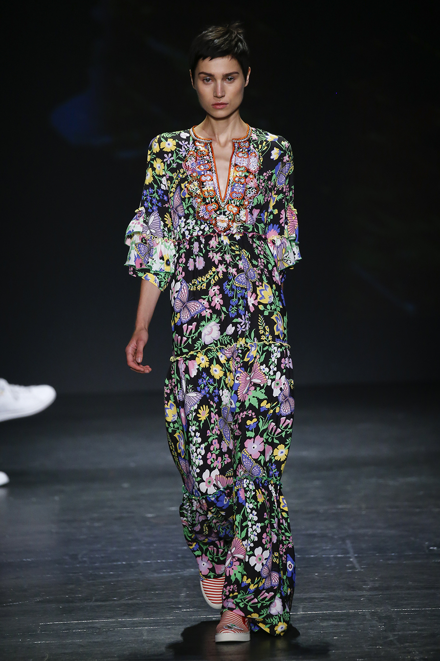
Pantone color of 2018 Ultra Violet
photo courtesy of Pantone
The color f 2018 is here. Color authority Pantone has announced the ultimate IT color for the year 2018; and it is a beautiful, blue purple hue named “Ultra Violet.”
Pantone goes through a lengthy process in order to determine the color of the year, each year. They study everything from politics to economics to what is trending in every aspect of design; fashion, art, interior design, sculpture, architecture, automotive design, food, and more. In order to give you the most useful information about the IT color of 2018, I hopped on a conference call with Pantone to learn all about their analysis, process, and the color of the year 2018, Ultra Violet.
Ultra Violet evokes the climate of our times. People right now have visionary thinking. We are exploring new technologies, and we are looking forward to what will be discovered, and created, in the future. Purple is the color of “transformation,” it symbolizes new discoveries, mindfulness, and power. It has a magical and mystical vibe; which is why it was favored in the late 1960s and early 1970s. Purple was, and still is, psychedelic; and it is , and was, favored by the counter-culture. Think Hendrix’s “Purple Haze.”
If you think about the counter culture of the late 1960s, and early 1970s, it was a time of discovery, change, and protest. Does this sound familiar? Perhaps it does. This also reflects the current climate we are living in right now. We are discovering new technologies, seeking change, and protesting what we don’t agree with. This is our current vibe, you dig? 😉
As we moved towards our current time of transformation, we began to see Ultra Violet popping up in fashion with the fall 2016 season; and each season it has slowly gained traction. Now, as we move into 2018, and the upcoming spring 2018 fashion season, we are seeing Ultra Violet explode.
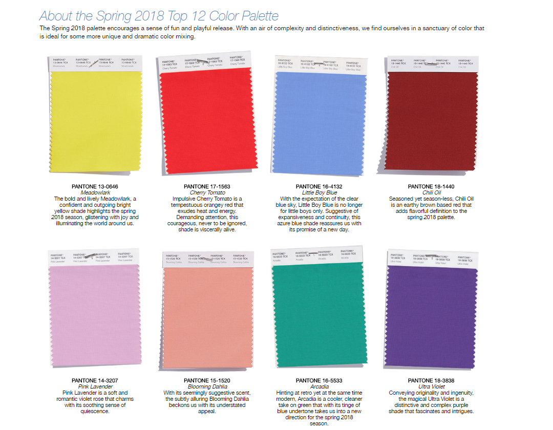
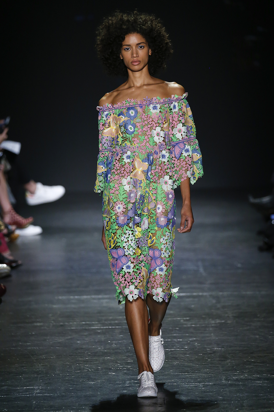
Ultra Violet, and similar blue purple hues, are being shown as stand alone colors in fashion. We are going to start to see solid colored clothing, as well as accessories and beauty products, in this blue purple hue as we move into spring 2018. In addition to purple dresses, pants, coats and the like, we will be seeing Ultra Violet mixed into various prints.
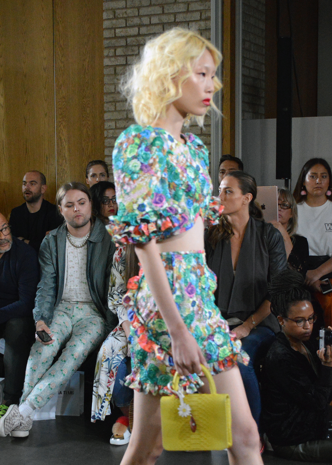
Ultra Violet used in a floral pattern on the Nina Tiari spring 2018 runway at New York Fashion Week. Photo Credit: Cathy/Bay Area Fashionista 2017©
It isn’t just fashion where we will see Ultra Violet take form. Both luxury and economy cars are experimenting with the color, and interior design will be using the blue purple hue more often in decor. Artist, sculptures, architects, and even chef’s are using Ultra Violet and similar shades in their work.
Purple is also starting to get popular as a color used in lighting! Designers are using purple lighting in bathrooms, hotel rooms, and other places where they want to create a calm and inspiring vibe.
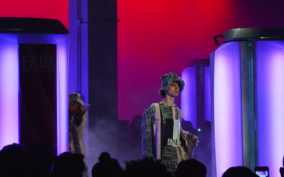
photo: Maison the Faux spring 2018 runway at New York Fashion Week, notice the purple lighting. Photo credit Cathy/Bay Area Fashionista 2017©
Our world is so over-connected, Ultra Violet is a fabulous, calming hue which helps us all seek refuge from the world as it is today. It is a mystical, magical color which inspires us to discover and create new technologies, art and the like; while it guides us into the future. Cheers to 2018 and what it will bring!
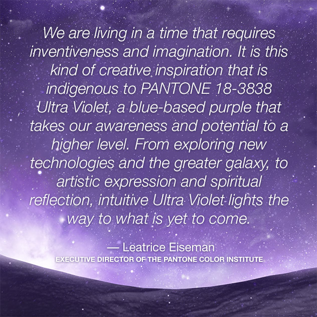
photo courtesy of Pantone