Beauty


Chanel Lilis nail polish for summer 2013

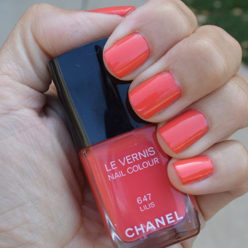
One of the big color trends for summer 2013 is neon. So it is no wonder that Chanel, the design house always on the forefront of fashion, would create a beautiful, neon orange hue for the upcoming hot weather season!

Neon orange. Now is this a color most people would seek out? Probably not; that is, not until Chanel Lilis nail polish came out for summer 2013. Leave it to Chanel to invent the perfect shade of neon orange! Lilis is a sophisticated neon orange hue which has just right amount of oomph without being too bright. Chanel Lilis offers a warm orange hue which has slight pink undertones. The pink undertones allow Chanel Lilis nail polish to work with colors such as blue and green which normally clash with a true orange shade.

Chanel Lilis nail polish applies smoothly and evenly in two coats. The color works well with summer 2013’s bright color palette as well neon hues. Despite being a neon color, Chanel Lilis also works well with summer 2013’s vivid pastel color palette; perhaps due to the slight pink undertones.
Chanel Lilis nail polish and the entire Chanel summer 2013 collection can be purchased here

chanellilus1 (1)

Photo: Chanel Lilis nail polish for summer 2013. Two coats of color, one base coat, no top coat.

Photo credit: Cathy/Bay Area Fashionista 2013

Chanel Taboo spring 2013 nail polish review

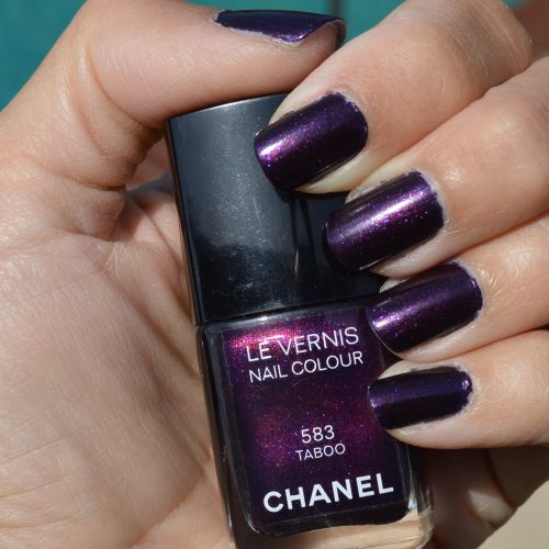
Chanel has released a late-spring nail polish color; Taboo. This sparkling nail polish color is not what one would expect to see in the warm, late spring months, which could explain the name “Taboo.” Chanel Taboo nail polish is a deep, dark purple with red undertones. In the bottle, Chanel Taboo looks like a swirl of sparkling purple and red nail polish, but this is not the case when applied.

I applied two coats of Chanel Taboo nail polish and the color turned out to be a true, deep dark purple. The dark purple hue is enhanced by a plethora of sparkles which add a whimsical flair to the vampy color. Surprisingly, this dark purple color works well with the bright colors of spring 2013 and blends easily with the oceanic colors of the season. Due to the red undertones, Chanel Taboo also blends well with red and pink apparel. Love that!

For the past few seasons we have been recommending short, neat nails for dark nail polish. Not for spring 2013. The new trend in nails is to grow them long! Nails should be curved or slightly pointed at the tips; not squared off. Of course, if you prefer shorter nails, keep your nails short. Nothing is more impractical than long, pointy nails! Chanel Taboo looks good on any nail length this season and since the color is so dark, it can easily be worn in the fall too. Fabulous!

Chanel Taboo applied evenly without streaking. We used one base coat and two coats of color; no top coat. Chanel Taboo is the one and only nail polish color in the late spring 2013 beauty collection from Chanel so it is easy to spot at Chanel counters everywhere. Chanel Taboo can also be found online at NeimanMarcus.com.

ChanelTaboo1

Photo: (Taken in direct sunlight-no filter or edits) Chanel Taboo nail polish spring 2013. One base coat, two coats of color, no top coat.

Photo credit: Cathy/Bay Area Fashionista 2013©


Laura Mercier spring 2013 lipstick review

Lipstick for spring 2013 is going in two different directions; pale or bright. Pale lipstick works perfectly with the season’s hot “Mod” trend and also blends easily with spring’s colorful eye shadow trend. Pale lipstick is a fabulous way to keep your lipstick from competing with your blue or green eye shadow!

The bright lipstick trend is on the other side of the spring 2013 beauty spectrum. Bright lips work perfectly with light and neutral eye shadow; a huge trend when wearing prints or a neutral color palette this season.

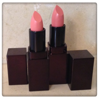
Laura Mercier sent us two lipsticks for spring 2013 to test out; “60’s Pink” and “Girly.” Both lipsticks are light pink and work perfectly with the Mod trend. Love them!

“60’s Pink” is a pale pink hue which blends easily with colorful eye shadow. The shade also works with spring 2013’s bright color palettes, neon hues and vivid pastels. Love it!

“Girly” is a slightly darker pink than “60’s Pink.” “Girly” also works well with colorful eye shadow, but since the pink is slightly darker than “60’s Pink,” “Girly” can easily be worn with neutral eye shadow as well as a natural face.

Laura Mercier lipsticks are nourishing and do not dry out the lips. I wore “60’s Pink” and “Girly” on two different days for a full day. The lipsticks did not dry out my lips and kept their color for several hours. I rate Laura Mercier’s lipsticks five out of five stars!

I highly recommend “60’s Pink for spring/summer 2013; especially if you plan to wear bright hues, color blocking and/or the Mod trend. “Girly” is a fabulous, classic light pink hue which is a great staple to have in your lipstick collection for any season.

To shop Laura Mercier lipstick, please visit LauraMercier.com or click on the photos in the shopping widget below. I included my favorite Laura Mercier lipstick hues for spring 2013 in the shopping widget. Hope you love them! Happy shopping, and stay fabulous 

lauramercierspringlipstick

Lipsticks c/o Laura Mercier