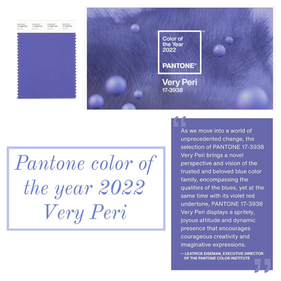
The color of the year is here! How pretty is “Very Peri” from Pantone?! This is the first year in a long time that the color of the year isn’t one of the top colors from New York Fashion Week’s spring color palette. While shades of purple have been gaining popularity for some time, this particular shade was a surprise! A good surprise, in my humble opinion.
Periwinkle is a fabulous shade of purple because it has the most blue of any purple hue. It can easily be described as half blue and half purple. Personally, I put periwinkle in the purple family because my eyes see more of the purple than the blue; even though they are evenly mixed. Although, Pantone describes it more as a blue, and they place it in the blue family. They are the world color authority, so they know!
If you go back and look at the spring 2022 color palette, you will see several blue hues, and one purple. Very Peri is a great color to tie them all together. As we move into 2022, you may not always see this exact shade of Very Peri. Use it as a guide and gravitate towards shades of blue and purple. Designers are showing various blue and purple hues which range from pastel, to vivid and bright. There is a shade of blue and/or purple for you!
I found a few fabulous items around the web which are in the periwinkle family. If you want to rock this color now, here are a few options to get you started!
What do you think of Very Peri for 2022? To read more about the color of the year 2022, please visit Pantone.com.
Thanks for stopping by!
XOXO
Cathy


