Stack it up with Twisted Silver’s newest eco-chic Lake Bracelet
Twisted Silver has done it again! The Lake Bracelet from Twisted Silver’s newest collection is a fabulous, casual bracelet which features recycled tumbled glass on a leather strap. Love that! The bracelet is just thin enough to be stacked and worn with other eco-chic arm candy or worn alone as a cool statement piece.
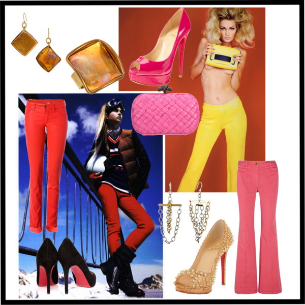
The pastel blue shade of the recycled glass is perfect for the pastel trend from the Paris and New York spring 2012 runways. The pastel trend is hot on the streets this season as the soft alternative to the bright color trend; making the Lake Bracelet the perfect piece of jewelry for softer hued days this spring and summer.
The Lake Bracelet by Twisted silver premieres online at twisted-silver.com on January 17, 2012 and is priced at $40. Please use coupon code INSIDERS for a 15% discount. Happy shopping and stay fabulous
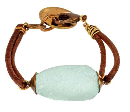
Lake Bracelet c/o Twisted Silver